Metropolitan coat of arms
Metropolitan coat of arms Coat
of arms of Tokyo Metropolis
(東京都ō, Tōky to-to Monshō) was enacted on November 2, 1943 under Capital City Ordinance No. 464 (告示第 464号). It is the same as the coat of arms of the former city of Tokyo, approved by the city council in December 1889. It is believed to have been designed by Hiromoto Watanabe (渡辺洪基, Watanabe Hiromoto), an alderman of the city.
The coat of arms features a six-rayed sun (which, as a red circle without rays or a dot, is at the center of the national flag of Japan) with a dot in the center representing Tokyo as the metaphorical center of Japan. Like most other prefectural emblems of Japan, its color is not designated. Crest can also be interpreted as a variant of the kanji ( Kyo
) from (
Tokyo
), but the capital's announcement does not explain as such.
Flags and emblems of Japanese prefectures (Part 1)
In Japan, you often come across interesting and unique coats of arms of certain cities or prefectures. For the uninitiated, these are mysterious pictograms, the meaning of which is unclear without explanation. Foreigners who are not familiar with the history and culture of this eastern country especially need clarification.
Heraldry is generally an interesting science, thanks to which you can learn a lot about a city, country or region. And already knowing the meaning of the flag, you can purchase, for example, the coat of arms of the Moscow government and place it in your office.
The number of flags that belong to megacities, settlements, and prefectures of Japan is virtually countless. Below we will introduce you to the flags of some local prefectures. We will tell you about the flags of the remaining prefectures in our next articles.
Hokkaido
A star with 7 rays represents faith and prosperity. The blue color of the flag represents the sea and sky in Hokkaido, the red represents the energy of humanity, and the white represents snow and light.
Aomori
The flag contains a stylized picture of the geographical outlines of the region, created from peninsulas. The white tone represents vast horizons, and the bright green represents faith in progress and prosperity. The symbol and flag of this prefecture were chosen in the early 60s.
Iwate
A kind of basis for the emblem is the unique hieroglyph “willow”, implying development. The green hue of the flag is the green of the forests in the prefecture. The flag was selected by the authorities back in 1965.
Miyagi
The prefectural mark is designed based on the hiragana "mi" sign and acts as the 3 leaves of the lespiceda. The petal that is placed in the center represents the prosperity of the prefecture, the petal on the left represents the teamwork of the people of the prefecture, and the petal on the right represents the love and their respect for their place of residence. The symbol of the Japanese region was selected from 1,615 projects submitted to the competition.
Akita
Its symbol is the original image of the katakana symbol - the first letter of the name of this area. It is intended to represent the rigorous progress in the development of the prefecture. The sign was invented and approved in the 50s of the last century.
Yamagata
The triangular symbols in the prefectural flag symbolize mountains. The 3 peaks form a curving line, similar to a river bed. The pointed edges of the triangles are a symbol of the rise in development of the area. The symbol of the area in question was also officially approved in the 60s.
Fukushima
The region symbol is hiragana - the first syllable of the name of the prefecture. It was officially established in the late 60s.
Ibaraki
The emblem of this area is an open rose flower, representing a shift in development. This sign was created in 1991.
Tochigi
The official symbol of this prefecture is depicted in the form of an abstract picture. It depicts a Chinese character, as well as three arrows. They correspond to ancient writing traditions. The flag, as well as other symbols, were formed and approved in the early 60s.
Gumma
The prefecture is surrounded by rocks, so the coat of arms of this region is decorated with a stylized hieroglyph. It is drawn surrounded by mountains and beautiful peaks. The flag has a purple tint. This is in keeping with the tradition of preserving cultural characteristics. It also represents elegance. White indicates calm. This flag was officially approved in 1968.
Saitama
There are 16 beads that represent the sun and are depicted on the flag. This is a symbol that indicates strength and development. In addition, it is a sign of purity. The symbol of friendship is a white background. The flag and coat of arms of the prefecture were officially adopted in 64 of the last century.
Chiba
In 1909, a prefectural emblem was designed that displayed several stylized symbols. This personifies the development of the field in Japan, the hope for further progress. The yellow symbolizes the turnip flower, although it is not the official flower of the prefecture.
Tokyo
This prefecture was given the opportunity to assign several flags to itself at once. They are used together. The first one was created in accordance with the coat of arms of Tokyo. On it you can see the sun, from which 6 rays extend. In fact, this indicates the capital of the country as the center, the main population center. There is an opinion that the basis was also a hieroglyph, which is part of the name of the capital. The flag is purple.
The second flag has a white background and a green symbol on it. This is a ginkgo leaf that is used as a symbol of prosperity, wealth and good development dynamics.
Top 10 Apps for Learning Japanese>
Capital flag
Tokyo Metropolis
| Proportion | 2: 3 |
| Accepted | October 1, 1964 |
| design | White coat of arms of the capital on a purple Edo background. |
| Developed | Hiromoto Watanabe (emblem) |
Flag of Tokyo Metropolis
(東京都旗, Tōkyō to ki) was adopted on October 1, 1964 in accordance with Metropolitan Statement No. 1042 (告示第1042号). In the center is the white Metropolitan coat of arms. The background color is Edo purple (江戸紫, Edo murasaki), which was popular in Edo, the name for Tokyo during the Edo period. This shade of purple is one of the traditional colors of Japan, almost identical to Web Indigo.
History of the coat of arms
The state emblem has its own past. Japan is a state that has not officially adopted this symbol. The main reason is that in the Middle Ages, the Land of the Rising Sun had a strong tradition of knights, which has survived today.
The personal seal of the emperor has always served as the symbol of the country. In 1183, the ruler of Go-Toba used the image of a flower with 16 petals to confirm his power. During the Kamapura period, other members of the dynasty followed the tradition. In ancient times, special signs of a military house were used in the form of a family monogram. He decorated personal belongings, dishes, and household items. The symbol was passed down from generation to generation. It was presented in the form of chrysanthemum, wisteria, peony, and mitsudomoe.
By mutual agreement of those in power, the chrysanthemum became the sacred designation of the imperial clan. The image acquired the status of a coat of arms in 1869, according to a document signed by the Meiji government. Somewhat later, a decree was issued (1371) recognizing the rights of the imperial family to use the symbol.
Severe punishment awaited those who did not belong to the Imperial House for using state symbols. Military actions deprived the reigning persons of the right to use the emblem.
The country has established the highest state award, the Order of the Chrysanthemum. It is customary to award it only to princes of the imperial family, representatives of foreign countries, and members of the government.
Metropolitan symbol
Metropolitan Symbol
Symbol Tokyo Metropolis
(東京都のシンボルマーク, Tōkyō no Shinboru Maku) was adopted on June 1, 1989 under Metropolitan Statement No. 577 (告示第577号).
The design was selected by the Tokyo Metropolitan Character Selection Committee (東京都シンボルマーク選考委員会) from 20 candidates. The winning design was created by Rei Yoshimura (レイ吉村), a professional graphic designer.
The bright green symbol consists of three arcs combined to resemble the leaf of the ginkgo, the capital tree, and represents the letter T
for Tokyo.
Symbol of Tokyo
When Tyoma Lebedev's studio began making logos for Russian cities, many were surprised. Why does a city need a logo? people asked in surprise. In Japan, such questions would not arise; here, every city has a whole set of symbols, and this tradition appeared in the country a very long time ago. For example, Tokyo has not one, but two symbols! The first of them was invented back in 1889; it looks like a sun with six rays. And the second one was introduced a hundred years later, and it is based on the shape of this leaf:
It turned out that the trees on which such leaves grow are very unusual...
The symbol is found throughout the city. They decorate drainage hatches, mark metro stations, and decorate city buses.
Even the carriages of the last line of the Tokyo tram display this unique green sign.
To be honest, despite their prevalence, I did not immediately recognize this leaf in the symbol. It took six trips to Japan to notice the obvious!
It is said that this symbol was chosen because it resembles the shape of the letter "T" (denoting "Tokyo"). Personally, I don't see this similarity. Maybe I need to go a few more times? But what a special tree!..
This is Ginkgo Biloba (or Ginkgo Biloba). In summer, its leaves are soft green, almost light green. And by autumn they acquire a beautiful bright yellow hue.
Ginkgo trees grow in large numbers along the streets of Japanese cities, giving entire areas a beautiful golden hue at this time of year.
Ginkgo is unique in that, unlike other trees, the veins in its leaves fan out, rather than branching out in a complex network from major to minor. The Ginkova class evolved from ferns some fifty million years ago, and is only very distantly related to other modern trees. Biologists have even given the Ginkgoids their own division right under the plant kingdom; today there is only one species in this division - Ginkgo Biloba. That is, there is a department of Tsvetkovyh, in which there are almost 300,000 species (including, for example, maples, palm trees and roses), and there is a department of Ginkgo, with one proud Biloba!
Tens of millions of years ago, Ginkgo trees grew all over the world, and scientists find traces of their specific leaves in fossils from many countries. They were able to identify at least ten different species, but all but one became extinct.
Look how beautiful the ginkgo trees look in autumn colors:
And here they are in Ueno Park. It’s not for nothing that I like to start my trips to Japan with Ueno!
In Yoyogi Park, ginkgo leaves cover the ground in a dense carpet in the fall. Here it is, Rosenbaum’s “on a carpet of yellow leaves...”
After the extinction of the Ginkgo species, these trees remained only in a small region of China. Scientists have studied the genetic diversity of modern specimens and come to the conclusion that they are all very similar. This proximity is explained by the theory that the last remaining groves of these trees were artificially maintained by Chinese monks for a thousand years.
In Asia they believe that ginkgo leaves are also beneficial. Many traditional medicines are made from them. However, the medicinal properties of the plant have not yet been recognized by science.
But no one can deny that ginkgo trees are very resilient. Some of them became famous, becoming almost the only living organisms that were able to survive in the immediate area of the atomic explosion of Hiroshima. All other plants and animals were destroyed, but six ginkgo trees, although badly burned, remained alive. And after some time they were healthy again. Seedlings from these surviving trees were sent to different countries as symbols of peace.
Ginkgos can live a very long time, with some living up to 2,500 years! That is, in age they are only slightly inferior to the giant North American Sequoias (although, of course, they never dreamed of such gigantic sizes).
Nowadays, Ginkgo Biloba is considered an ornamental tree, which has helped it re-conquer many parts of the world. Not only the Japanese love it, but also in Russia, where it is planted on the Black Sea coast. In Sochi, for example, Apricot Street is lined not with apricots, but with Ginkgo Biloba trees.
This is such an interesting symbol!
Capital symbol flag
Tokyo Metropolis (flag symbol)
| Proportion | 2: 3 |
| Accepted | September 30, 1989 |
| design | Bright green symbol of the capital on a white background. |
| Developed | Rei Yoshimura (emblem) |
Symbol Flag Tokyo Metropolis
(東京都シンボル旗, Tōkyō to Shinboru-ki) was adopted on September 30, 1989 under Metropolitan Statement No. 978 (告示第978号). In its center is a bright green symbol of the capital. Background color is white.
The history of the adoption of the flag as an official state symbol.
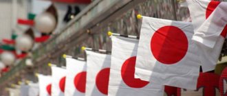
Despite its centuries-old history, the red and white flag began to be considered as a state flag relatively recently, only after 1868 during the time of global state restoration. Two years later, a white canvas with a red circle became the official commercial flag of the empire.
However, in the 19th century, the former flag of Japan was somewhat different from the modern canvas. Its proportions were equal to the ratio of 7:10, and the circle depicted on the flag was shifted relative to the center by 1% to the left. The modern canvas has a size of 2:3, and the symbol of the solar disk is located exactly in the middle. But in reality, for example, in municipal and private institutions where the flag-raising ceremony is celebrated, you can often find the old format of the canvas, this is due to its more aesthetically pleasing appearance. The new format is official and represents the country on the world stage. The colors of the flag have remained unchanged throughout its history to this day.
World War II period
During the Second World War, the flag of the militaristic and imperialist land of the rising sun was firmly entrenched in the consciousness of both the world community and the Japanese themselves. In the post-war period, the symbols and colors of the Japanese flag aroused nothing but violent hostility among some and others. Based on the general rejection of the red disk on a white canvas, heated discussions flared up every now and then, but the country was immersed in concerns about restoring both the economy and the social and political system, and therefore the issue related to changing the state symbol was forgotten against the backdrop of general immersion into more serious problems.
In the mid-90s of the last century, the public was again agitated by an issue that remained in limbo for many years. Disputes, which became the reason for making a specific decision regarding the ceremony associated with raising the national flag in government institutions, flared up in the highest circles of the country. With the beginning of attempts to expand the Japanese empire, the flag began to be used to shape the patriotic values of the people. The real propaganda began. In Japanese films, the imperial flag stood out compared to the rest. They were depicted with defects while the Japanese flag surprised with its ideal proportions. In order to develop children's patriotism, the image of the flag was transferred to educational publications, often accompanied by appropriate slogans. After the end of World War II, the use of the Japanese flag was banned. And only since 1947, the negativity towards the Japanese flag began to subside. Thus, the flag with a long history was first recognized as an official, having a specific standard, symbol of Japan, based on the law adopted on August 13, 1999. Since then, this date has been celebrated annually as the national flag day.


